According to the Polish Bank Association, “mobile-only” users reached 19.5 million in Q2 2025, accounting for 74% of all mobile banking app users [1]. It’s just one industry in which mobile app design is crucial for stable growth. However, despite great intentions, not all will succeed in this dynamic mobile application development sphere.
What makes the leaders and their mobile apps so different? Let’s find out.
Key takeaways about mobile app design
Here are some insights I hope you will gain from reading this article:
- People are using only apps that fulfill their needs.
- Add new functionalities with care and create habits.
- Implement ways to increase the retention rate.
- Always measure what’s most important.
- Undiscovered users are waiting to be invited.
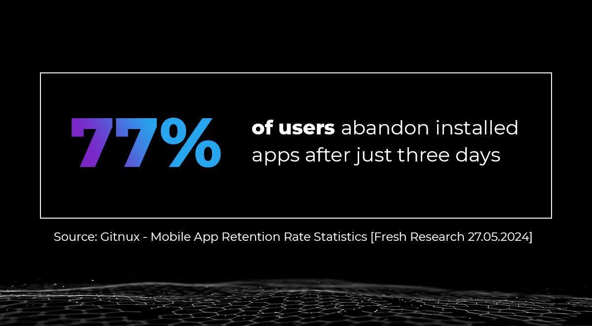
77% of users abandon installed mobile apps after just three days
This percentage can slightly differ between different categories, but the message is clear. If you want to keep your product profitable, an effective strategy for handling customer relations and enhancing mobile user experience should be your highest priority. Losing each user will not only decrease current sales, but you’ll also deprive yourself of future profits. Encouraging customers to reinstall your app, while they still remember some unpleasant experiences, will be harder and more expensive. It’ll require a higher marketing budget and really good reviews.

Customer loyalty is built by listening to their needs [3]. The client, satisfied with the service quality and application development direction corresponding to his requirements, will begin to buy more and more in-app services and products. A rewarding referral program will be the next step in recommending the application to friends and family. This path will not only increase your user base in a natural, organic way. Those people will become advocates for your solution. They’ll put their reputation at stake because they believe invited people will encounter the same experience.
The simplest measures work best. So, if you have nice customer success stories, share them on social media. It doesn’t have to be something big. People tend to identify with them.
That’s why I encourage you to understand your target group. Try to look at your mobile application from their perspective:
- What are their needs, motivation, and pain points?
- What is their intention when opening the app, and how do they do it most often?
- When an app is opened from an external trigger, can it quickly and precisely achieve success? Or do they experience difficulties?
Tools that can help answer these questions are:
- Direct conversations with customers.
- Reports and statistics data analysis.
- Feedback collection.
- Empathetic customer care service.
A real-project example? One of our clients had trouble with more than 15% of activations dropping off soon after releasing a new application to the customers. Besides giving additional training to customer care, we also gathered necessary data and pointed out potential pain points. We focused on one thing – making the activation process more immersive. By removing the need of authorizing user outside the app, we’ve decreased the failure rate by 1/3. And it was just the beginning.
New functionalities can lead to confusion if they aren’t complementary
Let’s pause for a moment and answer the following questions. How often during roadmap planning have you decided to foster clients’ existing user experience? How is enhancing mobile UX essential in every project? How do you design a mobile app according to unobvious clients’ needs?
New functionalities will draw attention but not win their hearts. Over time, the application can become overloaded with features that clients have never used.
Many Product Owners may feel like they know best how to develop their product. But sometimes, during a retrospective, you have to admit that something didn’t go right. The way you imagine this new functionality, which has been in your head for so many days, won’t always be so easy for users to understand. If they don’t recall where to find it or how to use it by the next day, we should revisit the mobile app development and design process.
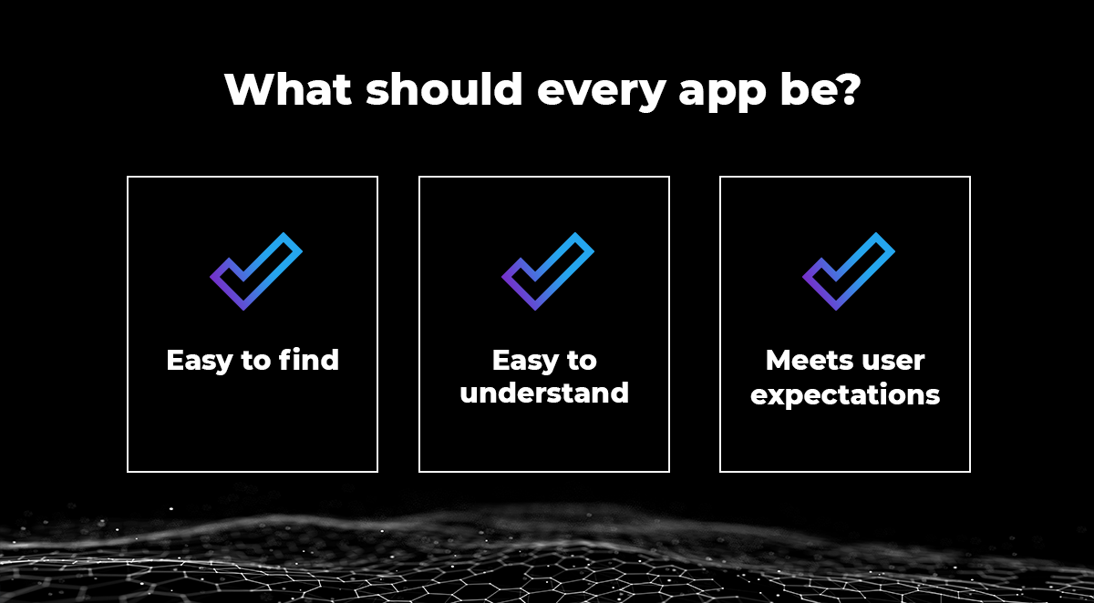
There are several methods that can verify if functionality and its design, they are: easy to find, easy to understand, and meet user expectations.

First of all, the simpler, the better. You shouldn’t overwhelm users with additional options before they can continue. The user’s main priority is to get the job done, so make it as fluent as possible. If you can prefill inputs or remember last used selections – do it. Adding tiny animations with suggestions for next steps will also do the trick.
Secondly, it should be easy to navigate. Prepare some flow diagrams or interactive mockups on Figma. Our QA (Quality Assurance Department) would love to dive into and check whether it’s intuitive and encourage users to use your mobile app again. This way, you will verify if the design provides enough information to walk-through users.
Researchers have strong proof that if you want somebody to use your app, you should enclose it with a habit by:
- Highlight core functionalities and always ensure the customer can finish the whole process, even when in a hurry.
- Connect a few features into intelligent processes. If your customer regularly pays someone, suggest setting up a direct debit.
- Send push notifications on a trigger instead of annoying recurring campaigns sent to everyone.
- Allow the user to personalize the app dashboard and suggest adding functionality as a shortcut.
This is a list of just a few steps to improving mobile applications and your success rate. In Ailleron, we’re focusing not only on delivering the best experience to end users. We’re eager to take on the challenge of creating hyper-personalized applications for everyone, and we are rewarded for it in our highly competitive industry.
User testing is another great practice to build strong relationships. By inviting customers to send their feedback about new features, you will gain their trust, increase loyalty, and improve overall satisfaction. Let them join the beta testers group. Highlight this newly acquired status with badges, small rewards, discounts, etc. Such care will earn you ambassador-level loyalty from customers, increase their engagement, and boost referrals and word-of-mouth marketing.
Let’s talk about retention strategies
User acquisition costs constantly rise, draining your budget and slowing overall development. Loyal users naturally stay longer in our application and buy the offered products more often. If your business plan involves having long-term clients, losing any of them will also mean losing all their future income and referrals. That’s why it’s so essential to ensure high user retention.
Only some users uninstall mobile apps immediately. There are ways to encourage the remaining ones to return, e.g.:
- Sending interesting push notifications to inactive users.
- Giving small special offers for returning users.
- Detailed app update description published at store.
- Different app icon that suggests changes being involved.
- Landing pages encouraging users to new functionalities along with quick navigation.
We’ve already talked about mobile app design that corresponds with user needs, that is personalized and easy to use every day. However, the more users you have, the more problems may arise. That’s why creating customer support for your product is a must. Every successful interaction will strengthen customer relationships. It can be done using multiple channels, like:
- Live chat with consultant via Livebank.
- Popular in present times chatbots, which can reduce wait times, resolve easier issues, or gather intel.
- Easy to find multi-channel support (email, phone, social media, etc.).
- Reviews in Google Play or App Store.
- Feedback collection mechanisms.
Customers expect the consultant to know the context in which they were calling before. By storing data on previous interactions in one place, the support team can proactively stay in touch with your customers, ensuring their problems are resolved. They can also provide insights into users’ pain points and which features should be optimized first.
Moreover, organizations must demonstrate that customers’ voice has been heard. Without replying to them or showing gratitude in front of everyone for how the received suggestions have improved the app, customers will slowly disengage.
Studies find that many users won’t connect with your support team to resolve their problems. Instead, they will uninstall the app permanently. In the next chapter, let’s talk about analyzing metrics and their effective implementation to spot potential issues before they arise.
Constantly measure what’s most important
When publishing an app update, you have to ensure you’ve prepared all the required tools to measure the success of the new functionality. Gathering analytical data from the beginning is invaluable. It will help you track changes and find reasons for deteriorating results. If you add effective metric implementation to this approach, you can stay ahead of your competition.
If, by any means, you’re not gathering data about your users, begin by defining which functionalities are the core for both app and business. I’ll give you a few tips based on my own experience.
Let’s consider one of the scenarios we investigated for one of our clients. User receives a push notification about a transaction that requires approval. Maybe she/he’s standing in line at the checkout or somewhere with a low signal at that moment. We’ve all been there.
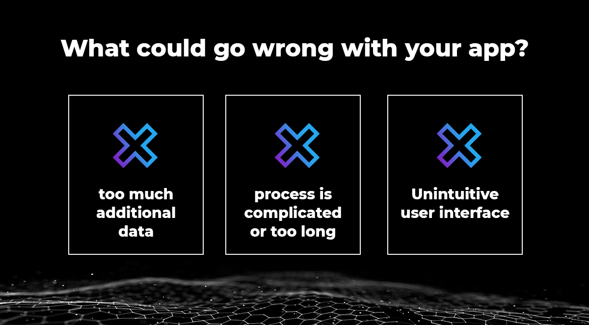
Striving to ensure the highest customer satisfaction, we first verified the percentage of transactions that failed. Let’s now look at what could go wrong.

Suspicion 1: Too much additional data that the app had to download
Researchers calculated that users are annoyed when an app startup takes longer than 3 seconds. Verify if you’re able to send all necessary data along with the notification in extras, like identifiers and transaction details. Furthermore, all data that isn’t required for the process, e.g., all user products, configurations, and transaction history, should be downloaded after reaching success.
Suspicion 2: The process is complicated or takes too long
Measure how long the process has taken since the app started. Next, focus on sessions that were longer than average. Examine how much additional data you require to be filled out. Maybe some are unnecessary, can be filled during a regular session, or can be suggested to the user.
Track what actions were most common after finishing the process. If the next step was minimizing the app or logging out, allow the user to return to the app’s login screen more quickly. You can also give them the opportunity to mark recipients as trusted. That way, they would be able to finish the process even faster. Less friction always equals higher satisfaction.
Suspicion 3: Check if the user interface is intuitive
To discover how your users behave in app, you can record volunteers or create a heatmap for selected screens. This will allow you to verify what they’re doing when going through the interface. Are they recognizing all elements correctly and don’t have problems using them?
After every release, you should continuously measure whether the success rate and other KPIs are still on the same level as before. Make sure they won’t degrade along with a rising user base. In the end, it’s all about effective metric implementation.
Another hint would be to gather user feedback. At the next normal app startup, you can ask what their impression was after using a recent feature or finishing the process.
Creating great UI, intuitive and easy-to-use user interfaces, and enhancing mobile user experience are important for one more group of users.
Reaching customers among people with disabilities
As the WHO report states [4], approximately 1.3 billion people – about 16% of the global population – experience some sort of disability. Now imagine that – around 70% of them are using mobile apps every day! When it comes down to choosing applications, this group is driven by convenience and ease of use.
If you would like to find out what difficulties they face, enable accessibility settings on your phone. I’ve tested it by myself, and trust me, it’s not easy to navigate through apps with those. I’m amazed by how stubborn and determined this group must be.
So, what is a good mobile app design that excludes no one? The designed interface should be intuitive, with elements on the screen readable and easy to select. Users should be able to resize font, zoom in on small elements, and change orientation to landscape without harming the overall user experience. WCAG guidelines may help because they aggregate design patterns, principles, and best practices. Still, the best user interface is the one that can be used naturally, without any additional guidance. You can find more information in Agata’s captivating article.
Adapting mobile applications to accessibility standards may take some time. A good idea is to focus on one area at a time. For example, it can be:
- Gather information about what accessibility tools your users are using. Some of them might require application adjustments.
- Analyze existing code and set priorities to find issues:
– Measure how much of this technical debt can be resolved through a period of time (e.g., during a single sprint)
– Solve accessibility warnings, starting from the most important ones - Add description to all graphics, transcription to video or audio.
Everyone involved in mobile application development impacts the final result. Consider who on your team is highly empathetic and would like to help emphasize the importance of this additional effort to this unique audience. Regardless, every design team member should ensure that tasks are accessible to individuals with disabilities.
Mobile app design that helps
We’re creating mobile apps for our users. Without them, they wouldn’t exist. Taking into account their needs, they will treat our apps very personally, almost identify with them. Let’s take care of our users and as a reward, they will guarantee us success in the long run.
Sources:
[1] https://www.zbp.pl/aktualnosci/raporty-i-analizy/netb@nk-ii-kw-2025
[2] https://gitnux.org/mobile-app-retention-rate-statistics/
[3] https://www.usertesting.com/blog/customer-retention-strategies

 Polski
 Deutsch


